 |
| Green with envy. |
First the boring stuff: painting. When I said this morning that I'd be happy with getting the greens
done on the Deathwing tester, I thought that would include more than just the chest eagle. That's all there is though, at least for the time being, but I will be thumbing through the codex, examining box art, and making use of the 360 view option on the GW site to see how they do things.
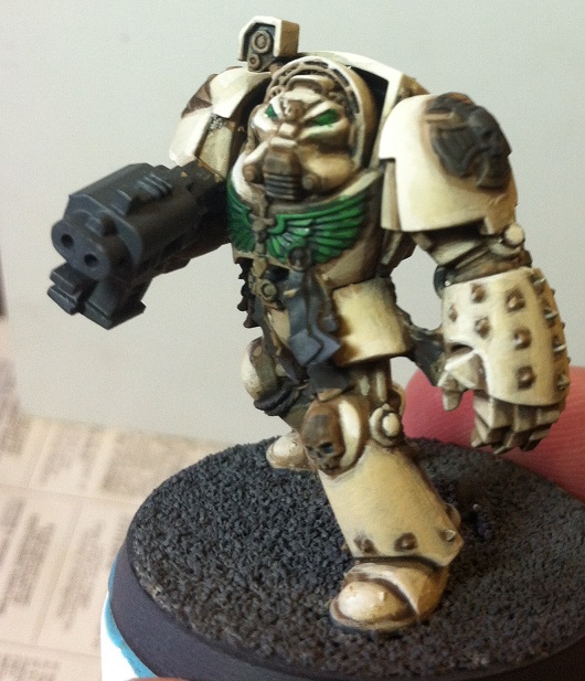
On second thought there is a bit more green than just the eagle. I did the eyes and the "lenses" at the end of the arm cables in green. Whether they stay that way is up for internal debate, though you can weigh in as well. Next up will be metals and reds, which I think will take care of the vast majority of the model. It's amazing what a little splash of color, even limited to the chest eagle and eyes, will do for a model. The internet seems to be frightened of the Christmas effect when red and green are paired on a model, but my Khador scheme should show that I am made of sterner stuff, so I'm looking forward to seeing how a darker-than-usual red affects this model.

Continuing with the painting show, I did more than just a dash of green on the Deathwing. While I had the greens out I took another pass at the Dark Angel tester with much better results than the first time around. The addition of a couple new greens, mostly VGC Heavy Blackgreen (the equivalent of a GW foundation) behaved the way I expected the previous color would and led to a longer session than expected. Using the aforemention Heavy Blackgreen as the base, Mutation Green came next as a general highlight, and Sick Green as a final highlight. I'm considering adding a further, sharper, brighter highlight, but I want to give my approach more thought before committing either way. Odd as it is to say this after 20ish years painting Space Marines, but I'm not so good at power armor. Highlighting gives me some fits, especially on the legs where I can't decide between leaving the whole thing alone as it wouldn't really catch any light, highlighting the top edge of any given plate, or going with some "ground lighting" highlights for things like the greaves. There was a discussion of this exact idea on a mailing list or forum or something recently that got me thinking. The basic point was to highlight as a way of drawing attention and creating definition instead of a literal interpretation of where light would hit. It's a bit outlandish for me, but the results are nice so it'll warrant some more perusing.
When I started this post my intention was to dig into Icarus a bit, since I now have it in hand, and give some initial reactions to the goodies it contains. My blogging mojo is flagging at this point, so instead of dragging out the process for a half-assed paragraph or two I'll just leave one little tidbit: watch the skies, I'll be dropping bombs on you soon.

No comments:
Post a Comment